| Mirror
Magazine |
||||
|
Sharks
off to Kenya It was their
moment on January 24, at the Beira Terrace of the Trans Asia Hotel
as the Kit Challenge Awards Night was held. The Kit Challenge
was a game based on the Survivor concept, but done Sri Lankan style.
Launched by Dialog GSM, it sought to associate KIT with youthful
traits such as endurance, vigour and survival. The evening
proved to be a wonderful end to the rich experience the adventurous
young participants received. Starting off with a somewhat bizarre
action song in which everyone participated enthusiastically, what
followed was a five-minute footage that gave an insight into what
the challenge entailed. They say that
the greatest challenge is the unknown opponents…and the Sharks
were the best at this game. The evening was an end to a great adventure
where the best among the best won and the rest walked away happier
and tougher, though a little bruised. The sponsors for Kit Challenge were Wild Holidays, SriLankan Airlines, Anchor ShapeUp, Yes FM, MTV and The Sunday Times. Daring
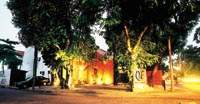
to be different Hidden by foliage,
and sitting in a discreet corner of Kynsey Road, the Q&E Advertising
office was originally a house. Today it has been transformed into
a state-of-the-art, modern workplace, where creativity has been
given full rein. You walk into
a reception made entirely out of glass (in keeping with modern decor
trends, while the transparency of the glass lets in light) and you
notice the lush greenery of the tree-shrouded environs, which provide
a protective shade to the building. This area, which leads into
the lobby, definitely has its own cool ambience. The lobby,
a stark, open space has a different feel. One long burnt-red handwoven
panel hangs from the ceiling. Wooden armchairs lend a homely, welcoming
touch and glass centre-tables are a focal point - a glass sits atop
a concrete stand, and covers a small silver star, which is placed
in the midst of thousands of madhatiya eta. Surreal, with an element
of fantasy one would think. But what is
most striking in the lobby is the huge concrete sculpture facing
the main area. As with any abstract work, it sets the viewer thinking.
"You could sit here and think that it can signify either the
circle of life or it could be nothing but a chunk of concrete,"
says Q&E's Communications Manager, Muditha Upasena. A partly hidden
wooden staircase, which is at the corner of the lobby, is another
attraction adding to the mystery of the place. The mystery, in the
case of Q&E, is that one would not know what to expect. This
staircase leads to the offices upstairs. Adding some
brightness to the stark decor are metallic statues of a dull gold
hue; "to give a futuristic, yet classic touch to the building".
These are adorned with the most unusual devices possible. Bicycle
chains, nails, screws, cogwheels and free wheels. Again it sets
the creative side of you questioning. But it is the
boardroom that is the piece de resistance. Designed in
black and gray, with a touch of red on the blinds covering the glass
windows, it speaks volumes about the creativity the company is renowned
for. A glass table on three concrete stands takes centre-stage with
subdued lighting providing a mellow atmosphere. The many awards
that Q&E have won over the years line up one side of the wall
on glass shelves. On the other are three pictures mounted on three
pieces of wood, painted black, their unfinished texture giving them
a concrete look. These pictures
command the attention of all in the room. The first has a teacup,
with a number of ants in the vicinity. In the next picture, more
ants have flocked there. In the last there are thousands of ants
in the teacup. With the teacup
supposed to represent the company, and the ants flocking towards
it the clients - these pictures make a statement. A statement which
seems to fit Q&E just perfectly. Creative decor
indeed, for a creative company. |
||||
Copyright © 2001 Wijeya Newspapers
Ltd. All rights reserved. |
 through
their decor and ambience, complementing their line of business.