
8th October 2000
News/Comment|
Editorial/Opinion| Business| Sports|
Sports Plus| Mirror Magazine

- Colour power
- My own sudha - Taste of Sinhala
- Hidden horror
- It touches the mind, spirit and heart - Book Review
- Opening up a world of literature and language
- No one told him - he knew what had to be done
- A queen's dream kept alive
- Vision for mental health becomes a mission
- You'd better pay up Mister! - Law and Citizen
- In search of gentlemen
- Here they are no different
- In pursuit of fitness - Funny Business
- Where do we go from here?
- Crowded houses
- Face to face with Jackie Chan
- They need support
- Lessons to ponder with two days to go - Thoughts from London
- Dramatic maturity
- The Wilde touch still lives
- Colours of the world
- Sharing their vision
- Letters to the editor


Uthpala Gunethilake looks at how local architecture is becoming a brighter sight
Colour power
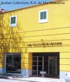
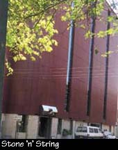
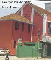
Take a walk down Galle Road. Through the dust, pollution and congestion, there is always something new to see. The latest attraction- or eyesore, depending on how you look at it- are those brightly coloured buildings. Standing amid other sober structures primly clad in cream or beige, these splashes of bold orange, royal purple or lemon green, screaming 'look-at-me', instantly grab the eye.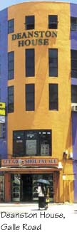 But
Galle Road is not an exclusive gallery for the exhibition of these buildings.
All around Colombo, boldly coloured offices, shops and other constructions
are appearing, pleasantly vibrant at best, an assault on the senses at
their worst. Suddenly our sense of colour seems to have turned a somersault.
But
Galle Road is not an exclusive gallery for the exhibition of these buildings.
All around Colombo, boldly coloured offices, shops and other constructions
are appearing, pleasantly vibrant at best, an assault on the senses at
their worst. Suddenly our sense of colour seems to have turned a somersault.
So what's behind the sudden conversion from pastel to bolder shades? Our search for the answers took us to several architects, known for their use of colour in design.
Though their work takes them on different beats, they agree that the uninhibited use of colour in any context-not just buildings- cannot be called a 'new trend' in Sri Lanka. "We have always had a tradition of colour. In our villages people use colour vibrantly," says well-known architect Anjalendran. Architect Madura Prematilleke agrees, pointing out that among the different ethnic groups in the island, the vibrant use of colour has always been a prominent feature.
 But
older buildings in the city, those dating 50 to 150 years are rarely colourful.
The bright buildings we see are either recently erected, or old ones painted
over to create a new identity.
But
older buildings in the city, those dating 50 to 150 years are rarely colourful.
The bright buildings we see are either recently erected, or old ones painted
over to create a new identity.
Anjalendran believes that this is where the colonial factor, which has exerted much influence in many areas of our lives, comes in. "Europeans brought us their sense of colour and it was rather limited. The notion of using only two shades, and keeping strictly to pastel colours only- these are colonial influences," he says.
"It's one of those Victorian reservations," agrees architect Channa Daswatte. "You simply couldn't use flashy colours on buildings. It had to be white or cream or other pale hues. But now people are expressing themselves differently."
As with everything else, now we seem to be slowly rubbing off those colonial imprints. "Cream and brown are not really colours. All this time people played safe with colour, but now they are bolder," observes Madura Prematilleke.
 What's
evident also is that most of these buildings serve either a corporate or
a commercial purpose, rather than being residences. In other words they
are buildings that need to advertise themselves. Mr. Daswatte observes
that along the Galle Road, Sri Lanka's unofficial highway, buildings have
always tended to look 'weird' architecturally, in order to be noticed.
"Now they are using colour on the entire building to advertise themselves.
Each building competes with the other," he says.
What's
evident also is that most of these buildings serve either a corporate or
a commercial purpose, rather than being residences. In other words they
are buildings that need to advertise themselves. Mr. Daswatte observes
that along the Galle Road, Sri Lanka's unofficial highway, buildings have
always tended to look 'weird' architecturally, in order to be noticed.
"Now they are using colour on the entire building to advertise themselves.
Each building competes with the other," he says.
"Remember that many people see these buildings while driving past," he adds. According to him, to attract the attention of someone driving at a certain speed, you need to employ a fairly massive attention grabbing device. "That may be why entire buildings are painted in bright colours," he says.
Outside influences are also not to be forgotten. "The popular MTV culture is full of flashy colours and it could be that a bit of it has rubbed off on us and is being felt in our architecture," Mr. Daswatte says.
He comments too that dark colours, rather than pale shades, weather better in a climate such as ours. "In our kind of weather, and given the pollution, pale colours get dirty easily and wear off. Also there are more colours available than ever before. Those days we had only a few weather-shield colours." With Dulux introducing a palette of over six thousand colours, people were given a chance to experiment with colours to their hearts' content.
 Madura
Prematilleke feels that Dulux launching their massive range of colours,
plus the TV programme that introduced the palette, "Paata Paata" was a
major breakthrough which changed people's perception of colour. "People
become interested in bringing colour closer to their lives."
Madura
Prematilleke feels that Dulux launching their massive range of colours,
plus the TV programme that introduced the palette, "Paata Paata" was a
major breakthrough which changed people's perception of colour. "People
become interested in bringing colour closer to their lives."
However, interest is not enough. To make the best of colour, one must understand it. Some of the best intentions with colour, where buildings are concerned have admittedly missed the mark. The reason may be ignorance. Says Anjalendran, "If you use colour well, it celebrates life and allows life to continue. You must know why exactly you want to use colour. I use colour to give joy to buildings."
Painting the facade of a building in a bright colour, he says is the decorative use of colour. "By that you can make a clear sense of presence," he says. "The sense of presence is what commercial buildings need to create for themselves."
"I use colour to give visual strength to a building, and I try to catch the sunlight by using the proper colour," says Madura Prematilleke. "But it always depends on the situation."
Next week:Understanding colour.
![]()
Front Page| News/Comment| Editorial/Opinion| Plus| Business| Sports| Sports Plus| Mirror Magazine
Please send your comments and suggestions on this web site to